I’m feeling generous! It’s a great day to give back to the community. Wait, what day is it? Anyway, the time has come for me to provide something of utility to the young storyboard artists out there. I have for you, for FREE DOWNLOAD (it’s on the internet, after all), my personal, made from scratch, professional commercial storyboarding template! Yes!
According to the file’s “created on” date, I crafted this template in 2009, when I began doing national commercials, and all my clients needed boards done in 16×9 format, for HD broadcast. Up until that point I was doing them in standard NTSC 4×3 aspect ratio.
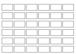
So, here’s a preview, and here’s the official link to the image, which you can save to your hard drive!
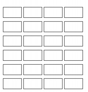
I’ll point out some details here. First off, this is not a definitive industry standard template (no such animal exists). It’s just the template I use for almost every project, and by nature of experience, I can testify it has worked out very well for me. But I by no means suggest that it is perfect for every storyboard. It is also not intended to be a “final” presentation storyboard- I use it to create my storyboards, and then after I’ve drawn them, the clients often give me their own template to transfer my frames into. So maybe think of this as a storyboarding workspace. It’s a bare bones grid of rectangles, in 16×9 ratio. Just add water. I mean, drawings.
The document itself is 3450 x 3600 pixels. That’s a fairly large image resolution but the frames themselves are only about 708 x 394, give or take. I’m aware that’s not HD resolution, and I’ll address that. If you’re looking for HD, scroll down to the bottom, where I have other templates available.
Lets talk a bit about why this template works well for me. As should be clear by now, I’m primarily a commercial storyboard artist, which means the stories I tell are about :30 long. The industry standard (if there is such a thing) number-of-frames-per-day for a commercial storyboard artist is about 18-21 frames, and that’s about right from what I’ve experienced.
So why use a 4×6 grid of 24 frames when 21 is the usual maximum? You see, a storyboard artist must provide more frames than the bare minimum, and sooner than the allotted time frame, because until the final versions are rendered and presented to client, one cannot know if the task is complete. For this reason, I always plan to overshoot the standard 21 frames per day standard, to be done sooner than the 8 hour typical allotment. Its like a “baker’s dozen” strategy- it’s not enough to only do what is asked, you must also provide alternate options, or at least be prepared for that possibility. Its very typical that when you present the final boards to client, they will, after seeing the work, realized that some things are missing, and that more work is to be done. If you had not accounted for this extra time, you’ll bust your deadline, and that’s the worst thing in the universe.
Blah blah blah. The point is, in the real world, you usually need about 21-24 frames in the final board, from which the director may edit to about 21 frames, and that’s why I made the template like this. 24 frames, all laid out nicely on one page, which is another advantage, and I’ll talk about that now.
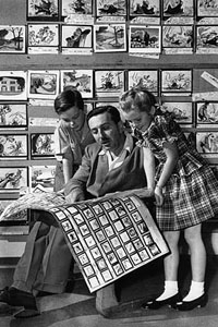
In my experience, in order to truly see the story “flow” you need to be able to see all the frames at once. Or, at least in large batches. It’s easier for you as the artist to plot the continuity between frames and see what is needed to tell the story visually. And it’s easier for the client to evaluate for the same reason. I’m not just pulling this out of my butt. Take a look (below) at The Diz pouring over some boards with his target audience. He likes them all arranged in large batches so he can “read” them like a novel. It’s natural.
Also- its easier to draw! Because you keep the previous frames in your working memory as you draw the successive ones. You can easily reference an earlier images you’ve drawn, and of course that helps make sure your drawings are consistent.
That’s in contrast to what I’ve seen some of my commercial storyboarding colleagues do: the “one at a time” approach. They fire up photoshop and make individual files for each of the frames right off the bat, in isolation to one another. As a result, the boards are drawn without ease of consideration of what came previous and what comes next. They end up looking like “key frames,” which are not storyboards, but rather individual standalone storytelling moments used primarily for pitch purposes. It’s easy to confuse the two. Another weakness of this approach is that it unconsciously pushes the artist to treat the image as overly significant, and as a side effect, the image resolutions are made much too high, with far too much detail, which takes too long, it’s just no good. And the file sizes end up being huge, which is another problem, because often you have to be able to email these images to clients, or upload them to servers, and that takes up more time as well. Technology advances quickly, and these issues may fade with time, but for now, they are relevant. It’s happened often enough that I’ve emailed clients their storyboards only to find out at the 11th hour that my files never made it through because the attachment exceeded the maximum allowed by their email client.
So it’s advantageous that the frames on my template are about 700×400 pixels. It’s in the “Goldilocks” zone; not to big, not too small, just right. I’ve used this template on hundreds of projects and it’s really stood the test of time, so I recommend it highly.
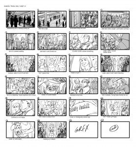
And as by means of demonstration, here’s an example of how the template looks after a day of work:
And, over the years, I’ve had to make other storyboarding templates, see below. I barely use them, but you may peruse and download them if you feel they could be of use. Enjoy!
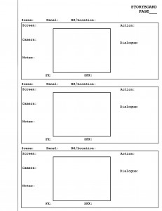
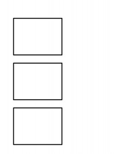
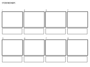
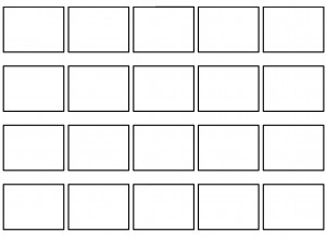
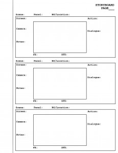
Those who are interested can also download the collection as a .zip file, HERE, and it includes the HD resolution version of my 4×6 template. Go for it!
7 responses to “Free Professional Commercial Storyboard Template”
I’m glad I stumbled upon this. I’ve been hired to storyboard a film and this blog is very helpful. Thanks!
I’m happy you like the blog. Good luck with your film project!
This is great! I am teaching a basic Video Art class for High School students this summer, and I really appreciate your insight and transparency. Thanks for allowing the public to use your blog as a resource!
Thanks for reading Kristen!
Hi Max, thanks so much for your templates. I am considering starting out in story boarding but you are so good that it’s made me doubt myself! Your illustrations are fantastic.
Would you mind you telling me what programme you use to create your boards in? I’m thinking sketchbook pro or toon boom storyboard (costly) for myself but I do possess photoshop already.
Also, do you sketch straight onto a monitor? I have a MacBook Pro with a really old Wacom tablet but wondering if the latest Wacom cintiq ( or something cheaper..) would improve things. There’s too much to choose from!
Would you mind sharing what hard and software you are using nowadays?
Only if you have time of course.
Thank you for your time.
Best wishes,
Claudia
Hi Claudia, thank you for the compliment! I use 90% Corel Painter and 10% Photoshop; I do all my drawing in Painter and all my tweaking and exporting in Photoshop. That’s what works for me, what works for you might be different. Maybe it’s like musical instruments- there isn’t one that is necessarily best, and different artists will have different preferences and inclinations. There isn’t really a standard in my circles, but I should also note that in my experience-
-Photoshop Compatibility (.PSD Format) is nearly universal
-Toon Boom Storyboard Pro is often used by those who work in primarily in animation.
So, I recommend using a program with Photoshop Compatibility (like Painter, Clip Studio Pro, or Photoshop, which are the major players from my vantage point.) that is either reasonably priced for your budget or offers a free trial, and see what sticks.
Additionally, I’ve just written a post about my new hardware setup, so check it out!
http://www.digitalstoryboards.com/archives/4445
Hope this helps! -Max
Hi Max,
Thanks so much for getting back to me and explaining which programmes you work in.
It’s been noted that PDS compatibility is the norm.
I think I’ll leave Toon Boom storyboard for the moment (costly!) even though my background is in animation. I’ll stick to what I already own (photoshop) and try some stuff out.
Also, thanks for your info regarding the hardware you have just purchased and photographing your work studio set up. I shall aim for that! Still seems like a heavy load to take along to meetings though. Is it possible to just take along the Mobile Studio Pro 16″ i7 and work on that or does it always need to be plugged into the MacBP and a power socket?
Best Wishes
Claudia