Categories
Apparel B&W Celebrities Females Humor Kids Males Samples Set Design Storyboarding Uncategorized

Old Navy Funnovations Inc!

[singlepic id=594 w=320 h=240 float=]   Well well well, Its been almost a year since I worked on these Old Navy spots and so it’s probably ok to talk about them now.  For those of you who don’t watch TV (the only excuse you might have for not seeing these ubiquitous commercials), these Old Navy commercials were for their early spring sale offerings and they are, as you might expect, kinda kooky!  As all good Old Navy commercials are.  What’s interesting about this project is that, with 5 spots being shot and worked on simultaneously, the line between pre-production (where my storyboards are made) and  production (when they actually shoot the commercial) started to blur.  It happens occasionally, but it’s not ideal, since its kind of like planning the battle while you are fighting it!  More on that later. I started work on these storyboards sometime during Xmas season in 2011.  I remember working (while sick with a cold!) on roughs for these on Xmas day.  I’m sure my dedication was appreciated but in the end almost all of that early work went into the trash can.  While this was the biggest job of my career, it was also the most stressful.  There are always outside factors that necessitate storyboard revisions, but the most damaging factor is the script change, and this job had many script changes, making it very hard to show passion for my work.  I love to make sure my boards are lookin’ good, but if you know the boards are likely going to be changed the next day, what’s the point?  Pride, of course!  But it really only goes so far before you have to start just cranking them out.  Hence, you may notice, that some of these frames don’t have my usual finesse to them.  The other major factor with that was our telescoping production schedule- everything was due yesterday. It got to the point that pre-production for one spot had abutted with the production on another spot. Meaning while we were planning and storyboarding the next spot, the directors were at the studio shooting the spot previous!  So we production artists had to move onto the set itself and make our own little workstations so that we could be near the directors while they were absolutely too busy to give us more that a few minutes each day.  Very stressful, because communication is so important, and there was very little to be had.  But we persevered and relied on our experience and instincts and we did a great job in the end!  Its funny how you can look back fondly on a job that, at the time, drove you bonkers! Here’s a bunch of photos I took from the set: [nggallery id=28]   And here’s the boards for each spot, and to finish off, at the bottom is a link to where you can find all the final videos. Enjoy! Shape Chute[slideshow id=27] New T Machine[slideshow id=26] Jeanvestment[slideshow id=24] Dealert[slideshow id=23] Bee Bots[slideshow id=22] And here’s a link to the final vids: http://www.brandnewschool.com/Projects/LiveAction/FunnovationsInc

Categories
Action Color Comics Crime Females Superheroes Uncategorized

K-Pow!! Zing!! Baff!

More comics!  So, this month (December) my artwork will be included in Heroes of the North: CODA – Omnibus #3!  It’s a collection of stories, with a bunch of artists contributing, and I’ve done a little two-pager for it.  I’m excited to finally be in real print.  I poured my skill into the work and I’m stoked that I’ll have a chance to show it off.  Here’s a peek at the cover (not my artwork):

[singlepic id=454 w=320 h=240 float=]


A little background, Heroes of the North is a Canadian superhero comic book title/film series being produced by Christian Viel of Movie Seals.  I like the characters in this series mostly due to the badass modern looking costumes they wear.  Its a fresh look for superheroes and reminds me a bit of the costume redesigns they used in the Watchmen movie.

Christian is an old storyboarding client of mine (from the days of Recon 2022) and a very good customer of my Dad’s special effects.  He saw the work I did on Three Minute Max and thought it would be cool if I drew couple pages for the upcoming Omnibus.  So I cranked ’em out, and we’ll see how they look in print!

This particular two pager features the heroine Fleur-de-Lys kicking the asses of two hapless criminals who were robbing a comic book store.  Well, I know my artwork was good!  Here’s a taste:

[singlepic id=452 w=320 h=240 float=]


[singlepic id=453 w=500 h=240 float=]


I used a new coloring technique on this project, building on what I used for Three Minute Max.  It’s a little quicker, and frankly, I like how it looks better too. So, go me for experimenting.  I’ve been reading a lot of books on color theory lately and attending lectures when I can find time – I have a long way to go with color, but I’m definitely improving.  Now I can take this new knowledge and apply to my own comic and storyboard projects too.

So, if you’re interested, maybe order a copy or something!  Shipping in December 2012.


Categories
B&W Corporate Females Kids Males Samples Social

One of my commercials airing now… NASDAQ OMX CENTURY

So, I’m sitting at home watching Mad Men, one of my favorite shows, and during the commercial break I see one of the commercials I worked on recently!  For those of you who don’t work in commercial production, it’s really a treat to see a commercial that you worked on, aired randomly, when you are watching TV.  To see it while you are watching one of your favorite shows is a double treat.  So when I saw my NASDAQ commercial air during Mad Men, I was over the moon.  I worked on these boards in February 2012, and saw them air in May, I think.  They still run sporadically, and you may have even seen them if you watch AMC at all (I haven’t seen them on other channels yet).  That’s the thing, had I not been following Mad Men on AMC (as opposed to Netflix) I wouldn’t have ever seen my commercials air!  That’s why I pay for cable, basically 🙂  To see my work in it’s natural finished state.

So these NASDAQ commercials were a little challenging but fun to work on.  The challenge was, we were advertising a company whose business involves listing other companies in their stock exchange.  Each of the two NASDAQ commercials featured 3 well known brands, so that’s like 3 mini commercials in one overarching commercial, times two.  Each brand needed equal screen time and presence, but needed to be subordinate to the main brand, NASDAQ.  Between two commercials, that’s 7 total brands, hard enough, but then you must realize that we need to also communicate with these 7 “clients” to make sure their needs are met.  So it was very challenging to keep a balance with it all.  As a result, the concept details were refined many times, and so the boards do look a little rushed, despite putting about three days of work into it.  What you see are about 12 frames per spot; however I drew upwards of 60 frames for the project.  So there was a lot of editing and refining. But I’m very impressed with the final outcome.

The first spot features Smart Technologies, Zipcar, and Hasbro.  These companies all list on NASDAQ, hence their presence in the commercial.  The story follows a day in the life of a young businesswoman/mother who relies on these companies to keep her life running smoothly.  The link under the boards goes to the final commercial.

[slideshow id=17]

Click here to see the finished commercial!


This second spot features Tesla, LPL, and Zynga.  Same deal as before, only this time with a businessman, fairly typical day, running smoothly, thanks to the before mentioned brands.  Click the link below the boards to see the final commercial and compare.

[slideshow id=18]

Click here to see the finished commercial!


Categories
Apparel B&W Females Hip Males Social Uncategorized

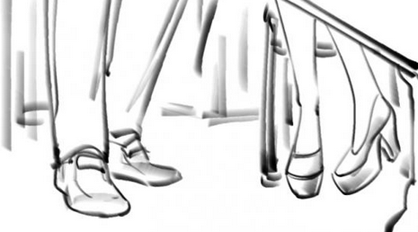
Saw one of my commercials on TV… DSW “Where’d you get those shoes?”

[slideshow id=13]

A couple of months ago I met with a new client and worked on their DSW commercial for a couple of days.  It was rainy then, as it is now… good day to write about it.   So anyway I worked on this shoe commercial and it was actually pretty hard!  I did like 60 frames in 2 days…  almost 40 on that first day!  So consequently, they are a little rushed (no shading or finesse) They needed a wide shot and a closeup shot of shoes for every scene and they had 3 spots to shoot.  I did all three spots but only posted one of them here, they are basically the same commercial.  I was happy to see these commercials when they aired a few days ago.

http://www.dswinc.com/tv_commercial.jsp

Categories
B&W Females Samples Storyboarding

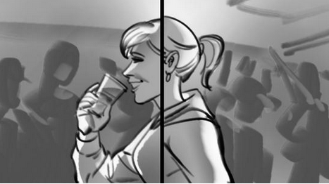
British Red Cross – PSA

Here’s some storyboards for a PSA for the British Red Cross, about … not drinking?  Drinking but not to excess?  Don’t leave your friends when they’re blackout drunk?  Or when your friends are blackout drunk, turn them on their side before you abandon them so that they don’t choke on their own vomit…. that’s it, that’s the one.  Anyway, this time the director used a split screen technique to show the girl’s fate play out in alternate universes.  Girl on the right lives and the girl on the left is worm food.  Too bad for her.  Storyboards turned out pretty decent though!  The director put the boards into an animatic and that looked pretty good- and the slideshow below should come pretty close to that!

[slideshow id=9]